https://andycarter.dev/rss<![CDATA[Andy Carter]]>2026-06-22T09:00:00+00:00<![CDATA[The inaugural Developers Up North]]>https://andycarter.dev/blog/the-inaugural-developers-up-north
Last Thursday, I had the privilege of speaking at the inaugural Developers Up North conference. A huge congratulations to Fejiro Gospel and his team for putting on such a successful first conference.
I felt very honoured to be sharing the stage with some incredible speakers. The talks on performance, and AI particularly gave me plenty of ‘food for thought’. I've come away excited about some of the things we can do to improve the performance of our websites, and move further away from SPAs.
Just as inspiring as the talks were the conversations around them. One of the things I love about community conferences is how inspired and rejuvenated I am afterwards. Developers Up North definitely delivered here.
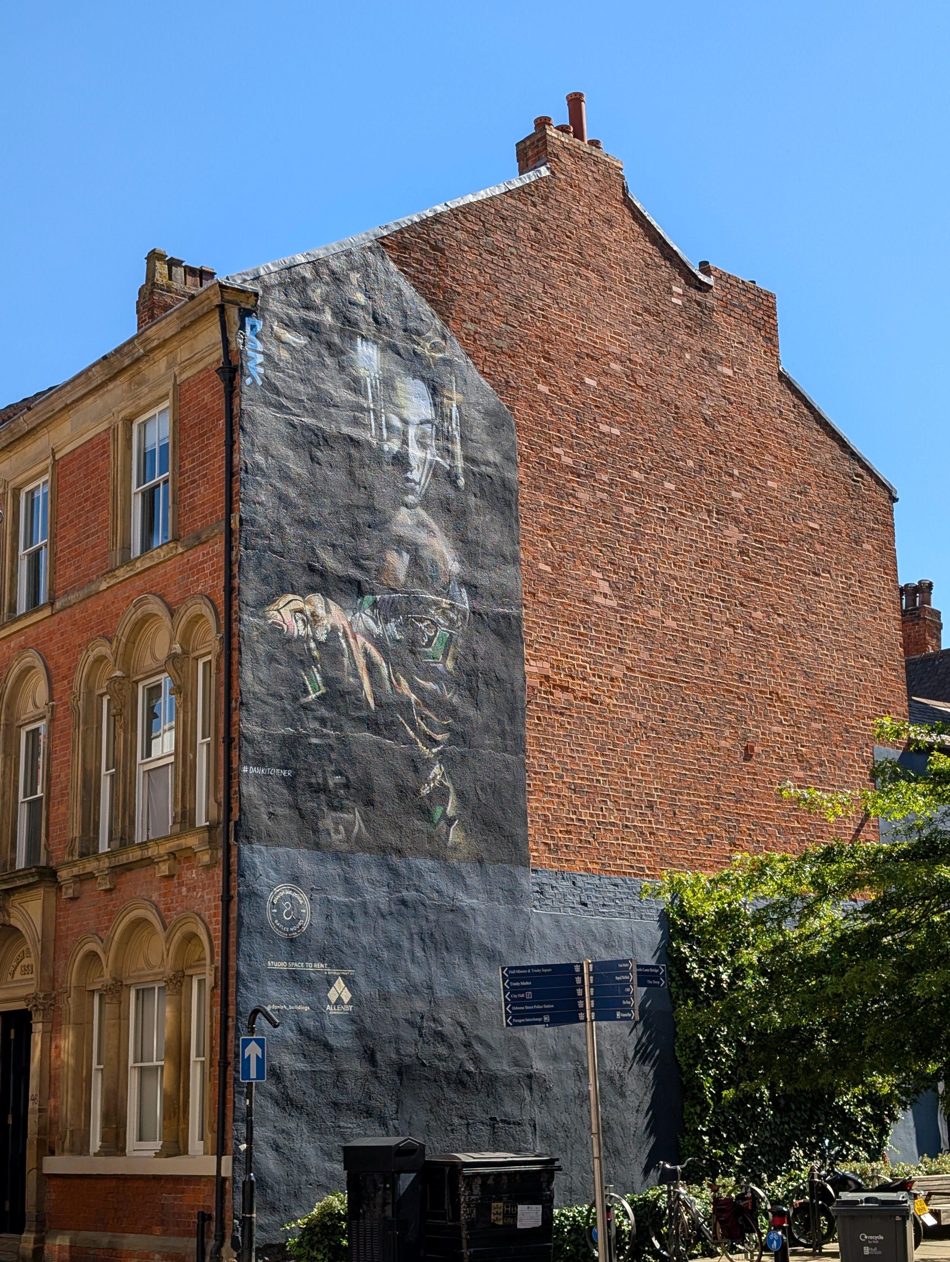
Attending the conference meant it was my first time in Hull since the late 90s. I have to admit the city surprised me in the best possible way. It has changed a lot. I loved exploring the many pubs in the Old Town post-event and even got to spot some of Hull’s street art.
Overall, I had a great time, met some amazing people and made new friends.
]]>
2026-06-22T09:00:00+00:00<![CDATA[How to write effective alt text (and why it's important)]]>https://www.evoluted.net/blog/design/how-to-write-effective-alt-text-and-why-its-important2026-06-14T23:00:00+00:00<![CDATA[A perfect Lighthouse score doesn’t mean an accessible website]]>https://andycarter.dev/blog/a-perfect-lighthouse-score-doesnt-mean-an-accessible-website
Chrome’s Lighthouse provides an invaluable tool for identifying accessibility concerns. However, people often misunderstand what the given score means.
Far too many times, I’ve seen people confidently claim that their website is accessible because they’re scoring 100% for accessibility in Lighthouse. This is not what the metric is telling us; it’s really important that we understand this.
Lighthouse, like other accessibility tools, is limited by what can be effectively tested through automation. Things like meaningful link text, resizable text and clear keyboard navigation require manual, real user testing.
Robson Square
The Robson Square steps in Vancouver architecturally look beautiful and at first glance look accessible. There’s a ramp that zig-zags up the incline and handrails at the edges. However, looks can be deceiving. These steps present many accessibility issues:
The ramp is too steep: the excessive incline is dangerous for most wheelchair users.
There are lots of trip hazards: the monochromatic concrete design makes it hard for visually impaired people to differentiate between the steps and ramp.
There’s a lack of safety railings: this creates a risk of falling for many people.
At the time of construction, the steps were built to meet the accessibility requirements of the day. If Lighthouse could assess real world architecture, they’d have scored 100.
CBC News
Lighthouse
Tools like Lighthouse aren’t bad. They’re useful for catching technical accessibility issues. However, we need to remember who we are checking accessibility for.
Accessibility issues are human-centred problems. There’s only so far automation can go before we need to do real-person testing. Lighthouse can’t replicate the lived experience.
Lighthouse is at its most useful when the returned score is below 100. Not because this is a desired result, but because this is when it highlights possible issues worth investigating.
A score of 100 also doesn’t imply that the potential issues Lighthouse can test for aren’t still problematic. You may have provided alt text for all images, but whether that alt text is useful is another matter.
It is possible to get a 100% accessible Lighthouse score for the most inaccessible site.
We need to recognise the limitations of Lighthouse and other automated testing tools for accessibility. Getting a perfect Lighthouse score is just the first step towards building an accessible Web.
]]>
2026-05-18T10:25:00+00:00<![CDATA[The final All Day Hey]]>https://andycarter.dev/blog/the-final-all-day-hey
Yesterday, I attended the final, and my first, All Day Hey with some of team Evoluted. I’ve come away feeling very enthusiastic and motivated about the Web.
These current times can seem strange, and sometimes even scary, for our industry. In the last few years AI has become a major disruptor. So it was refreshing to see so many talks demonstrating the power of human creativity and engineering; people from our industry who care about the Web and the people it serves.
It was also great getting to meet so many new and old friends at the conference and evening social. Community is so important. Keeping connected with real people really helps us move forward, and build better.
I’m now super excited about heading to Hull next month for Developers Up North. This should be another great community-led conference. Plus, I’ll be on stage speaking at this event.
]]>
2026-05-08T08:28:00+00:00<![CDATA[Toast notifications are now a Laravel default — that's a problem]]>https://andycarter.dev/blog/toast-notifications-are-now-a-laravel-default-thats-a-problem
Last week I read that Laravel’s starter kits now ship with Toast notifications by default. Many seem excited about the news. I’m not one of them.
Toast notifications may look clean and modern, but they pose serious issues for many people. I believe that making them a default in a popular framework like Laravel is a wrong direction.
Let me explain why this is a poor choice, and why it should matter to you, even if you consider yourself a backend developer.
What’s wrong with Toast notifications?
They can be invisible to screen reader users
If a Toast notification isn’t correctly set up with an ARIA live region, screen reader users will not hear it. Screen readers are used by those who are blind, visually impaired or have other disabilities like dyslexia.
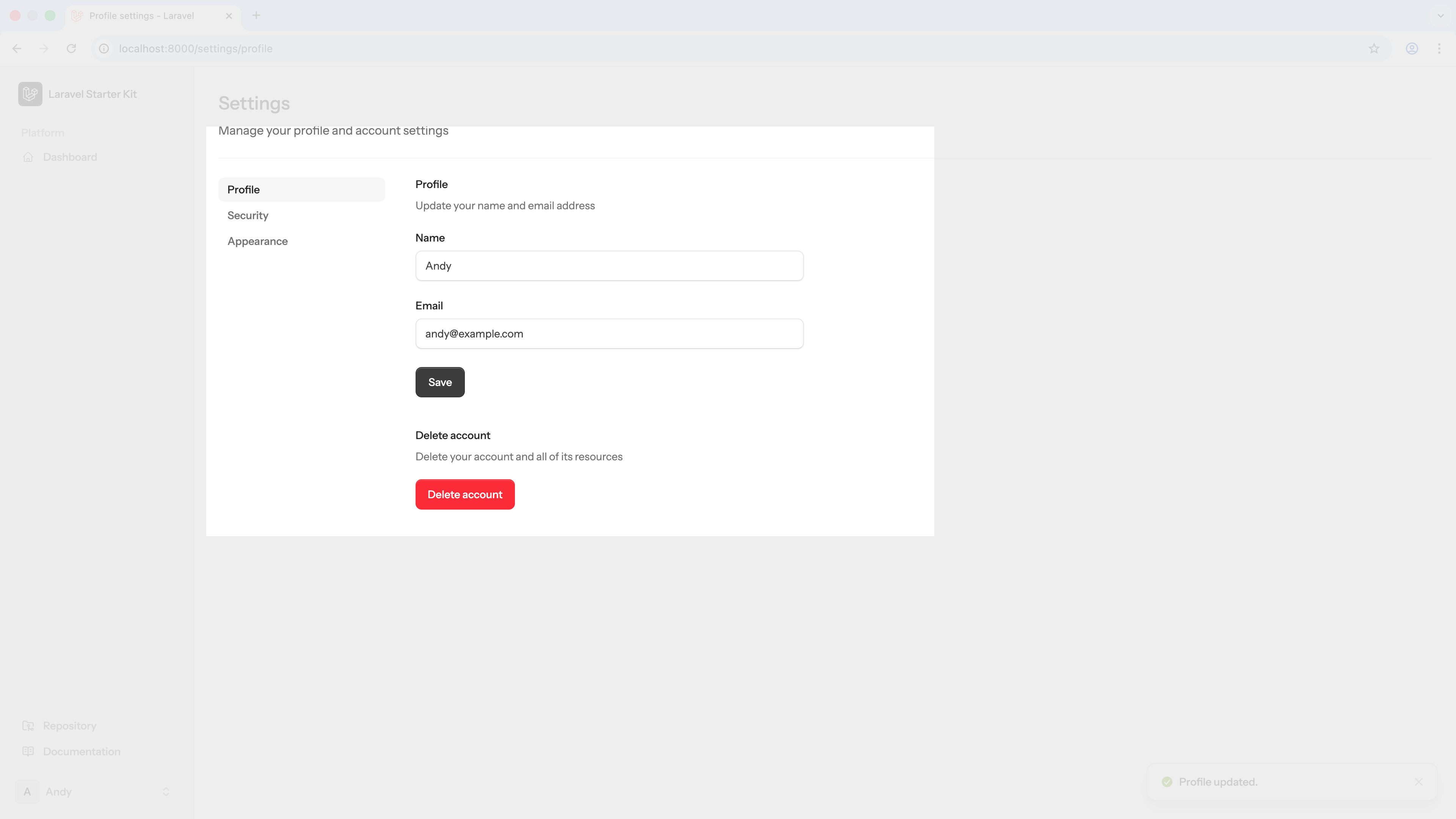
In fairness to Laravel, my initial tests with two screen readers did announce the notifications. I set up a basic Laravel app using the Livewire starter kit and tested the settings page. I tested with the widely used NVDA screen reader and MacOS’s inbuilt VoiceOver.
Whether the Toast notifications remain discoverable to screen readers as an app develops remains unclear.
They disappear before many users can read them
Cognitive impairments are common. They can impact the speed at which someone processes information, or cause attention difficulties. The short-lived nature of Toast notifications means that many users will not have chance to read them.
Once the notification has disappeared, some will be left unaware of the status of the process they’ve just triggered. This leaves the user having to guess, refresh or simply try again.
You don’t have to have a cognitive impairment for this to affect you. If a user is distracted — perhaps a colleague interrupts them or the phone rings — they miss the notification too.
They appear off-screen for screen magnification users
For those with a visual impairment, screen magnification is a commonly used assistive technology. For these users, they typically only see a fraction of the screen at a given time.
Representation of the visible area of the viewport when screen magnification is used. The Toast notification is hidden off-screen in the bottom right.
Toast notifications typically appear in the corner of the viewport. For screen magnification users, these notifications will often appear off-screen with no indication of any status change.
A well-configured app will scale text to support the user’s preferences. This should include Toast notifications.
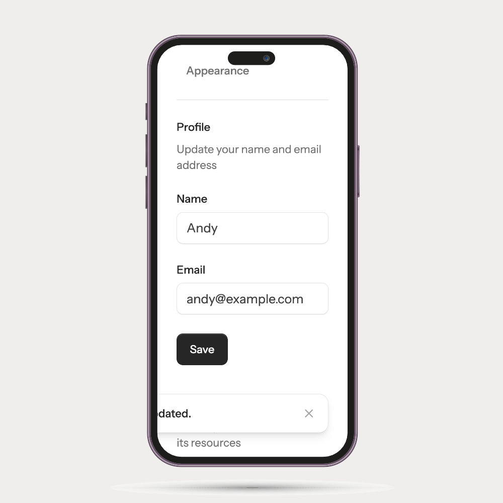
My quick tests of Laravel’s Toast notifications revealed that they do scale with the browsers text size settings. However, this does reveal another common issue with Toast notifications: the text can overflow the viewport.
Mobile device with large text size enabled. The Toast notification overflows the viewport with only some of the text visible.
When the notification doesn’t fit the viewport, it means some of the text becomes hidden to the user.
Keyboard users should be able to dismiss them
If a user is navigating by keyboard, they should be able to tab to close it as soon as it appears. However, the close button of a Toast notification is often not the next logical focusable element.
My tests with Laravel’s implementation revealed it is possible to dismiss the notification with the keyboard, but navigating to the close button was problematic. It was not the next element in the tab sequence.
The real cost of Toast notifications
When a notification fails to be fully perceived by a user, they lose confidence in your app.
Did a form submit? Was a payment successful? Did the file upload? If the only way to confirm is by refreshing the page and checking for yourself, you have a problem. If this becomes a repeated experience, you lose a user.
Accessibility failures don’t just impact a small group of edge case users. Disabilities affect a large number of people, we just often don’t recognise this.
Accessibility failures can also impact everyone when we find ourselves in situations that affect our workflow: a user that is stressed, distracted or mentally fatigued; or someone that is using a screen in bright sunlight.
When we build applications that work for those with assistive needs, we build for everyone.
Why this is a backend developer’s problem
As backend developers, we often hold a lot of influence over choice of framework and starter kit.
Admin panels and internal tooling are often built entirely by backend engineers; frontend developers and UX specialists often never get involved. It means user experience and accessibility are often forgotten.
Backend developers rarely talk about accessibility. Either through a lack of awareness or a misplaced assumption that it is someone else’s problem. However, our decisions often have a direct impact on the people that need accessibility considerations.
The people that use are apps are real. Many have assistive needs. They deserve to be able to work with the tools we build like everyone else.
When you choose a framework, starter kit or UI component library, you are making an accessibility decision. When you choose to use a default that creates barriers for many users, you are making an accessibility decision. This is your choice, and your responsibility.
The alternative
Instead of using Toast notifications, we should use a more inclusive solution. I would recommend using inline notifications that respect the user’s text sizing preferences; and if you must make them dismissible, let the user decide when they want the message to disappear.
Good notifications should be persistent and visible.
Accessibility is more than a frontend developer or UX specialist’s problem. It’s an engineering problem. We must recognise that the decisions we make have consequences. Enabling Toast notifications by default is one of them.
]]>
2026-04-20T09:15:00+00:00<![CDATA[The importance of captions: ensuring your content is heard]]>https://www.evoluted.net/blog/design/the-importance-of-captions2026-04-13T00:00:00+00:00<![CDATA[2026's WebAIM Million report suggests we're regressing]]>https://andycarter.dev/blog/2026s-webaim-million-report-suggests-were-regressing
This year’s WebAIM Million report is out. As always, it provides an interesting insight into how well we’re doing as an industry building an accessible Web.
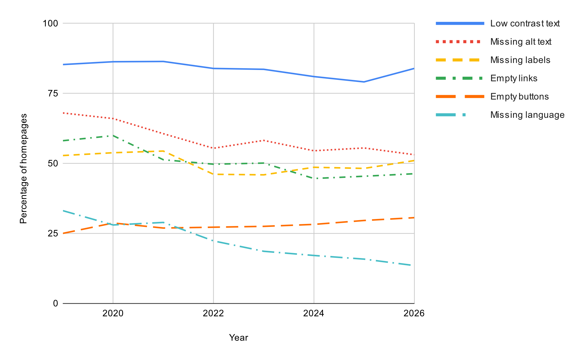
Sadly, the findings aren’t encouraging. The slow progress made in past years is being undone. Not only are we still failing to get the basics right, things have actually gotten worse since 2025.
Homepages are becoming more complex, and with that complexity comes reduced accessibility. In just one year, the average number of elements on a homepage has increased by 22.5%.
When we don’t take accessibility into account, we inadvertently create barriers that exclude many people from using our sites. Those excluded users are our friends, family and neighbours. They are potential customers unable to complete a purchase. We can and need to do better.
A good starting point is to review your own websites for the six most common issues highlighted by WebAIM’s report. These six account for 96% of all detected errors. Addressing these would make a meaningful difference to your users.
]]>
2026-04-01T16:00:00+00:00<![CDATA[Is your code ready for summer time?]]>https://andycarter.dev/blog/is-your-code-ready-for-summer-time
This weekend in the UK, the clocks jump forward. For developers, this is more than a lost hour of sleep. It’s a test of how our code handles shifts in timezones.
On Sunday, clocks go forward an hour at 1am. In other words, we go from 00:59 to 02:00.
It’s easy for us to write code for the ‘now’ and forget that twice a year we shift timezones. This often trips people up, especially early in their careers. Sometimes, the consequences of this oversight can lead to big headaches the day after the clocks have changed.
What things do you need to check ahead of the switch to summer time at the end of this week? Here are some suggestions.
Scheduled jobs
If you have automated jobs scheduled, do these fall within the skipped hour? What will happen when these fail to run? Similarly, when we fall back to GMT in the autumn, what happens if these jobs run twice?
Third-party integrations
If your code talks to remote APIs, are assumptions made about the timezones in the two systems? If the API uses UTC, but you’re passing local times, then you could be an hour different for the duration of summer time. This is unlikely to be the desired situation.
Displayed dates
Regardless of which timezone you store datetimes in your database (it probably wants to be UTC), your users will most likely expect to see dates and times in their local time. If a customer orders something on an ecommerce store at 11pm next week, what weekday will their account show for when the order was placed?
Are you ready for British Summer Time?
The lost hour of sleep this weekend is unavoidable, but bugs in code relating to the shift don’t have to be.
]]>
2026-03-23T10:00:00+00:00<![CDATA[Always check the source]]>https://andycarter.dev/blog/always-check-the-source
The last couple of weeks I’ve been researching a blog post. During that process I came across a statistic that seemed perfect for what I was writing.
The statistic was being used to make a fairly bold claim. I hadn’t come across this ‘fact’ before, so decided I’d dig a little deeper.
A bit of searching revealed multiple articles repeating the same claim; some even citing the original research it supposedly came from.
After jumping over a few hurdles, I finally managed to get hold of the original white paper. To my surprise, the statistic didn’t represent what the many articles claimed it did. In fact, it told a very different story.
It turned out that several sites had taken the statistic and skewed its meaning to support their own arguments.
The fact that so many sites repeated the same misinterpretation suggests they hadn’t checked the original research at all. They were simply copying each other, much like a game of Chinese Whispers.
The Internet is rife with misinformation. My time in physics research taught me the importance of verifying sources. As professionals, we need to be confident that what we share is accurate; that means going back to the original evidence whenever we can.
Let’s help break the cycle of misinformation.
]]>
2026-03-06T11:00:00+00:00<![CDATA[Why colour matters for creating an accessible browsing experience]]>https://www.evoluted.net/blog/design/why-colour-matters2026-02-17T00:00:00+00:00