I’ve been taking a look at the accessibility of e-commerce websites. One in particular has amused me.
In many regards this site has gotten accessibility right. They’ve generally used good colour contrasts, images have alt text, there are skip links in helpful places and form inputs are labeled. However, visually impaired customers using a screen reader will be getting a very different shopping experience to sighted users.

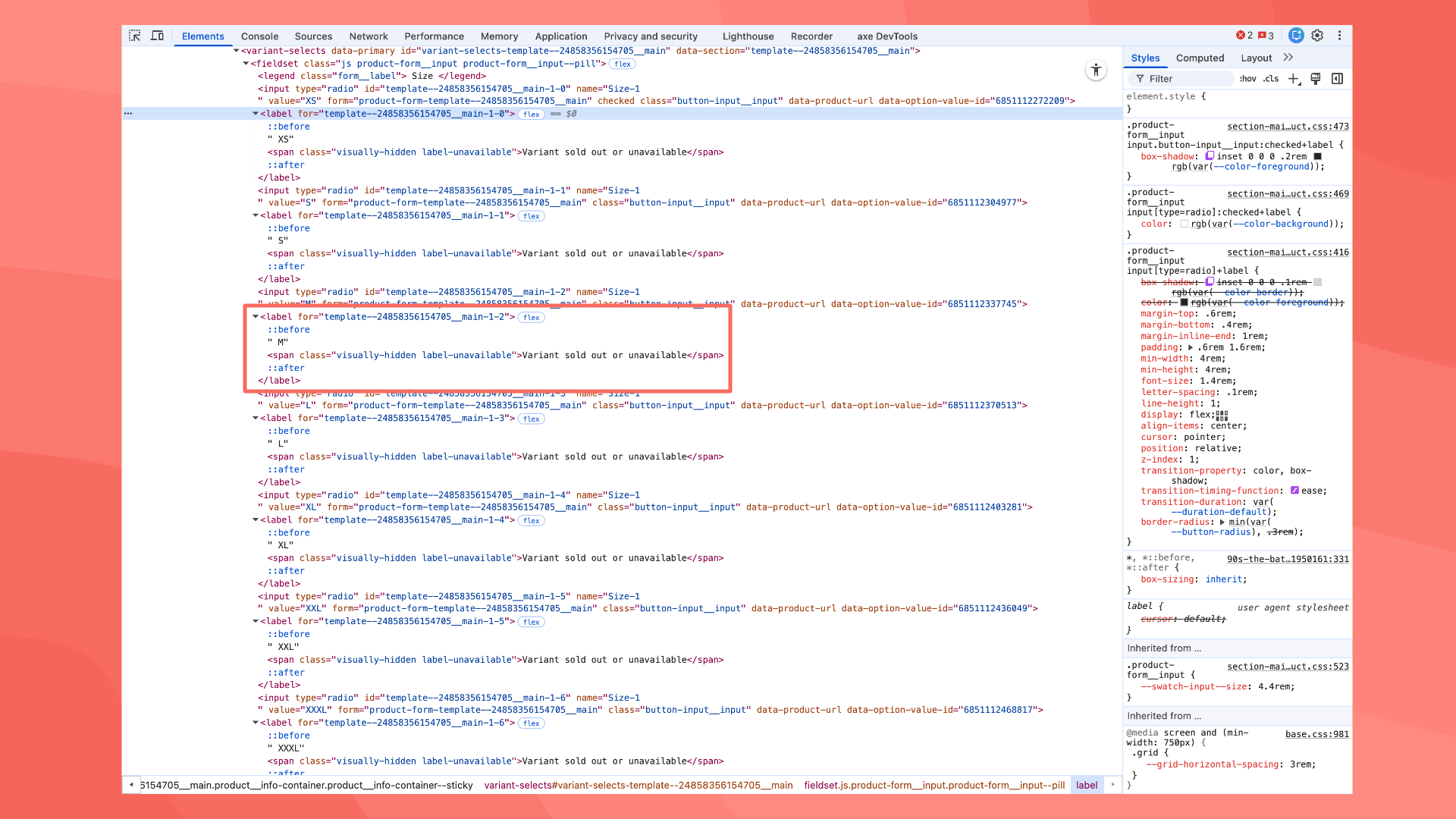
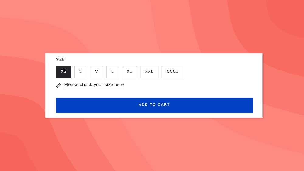
Every product with sizes has a visually hidden label that reads ‘Variant sold out or unavailable’. That means if you are using a screen reader, it will appear that the store is completely out of stock. Have they really sold out? No, visually all sizes are shown as available and can be added to the cart.

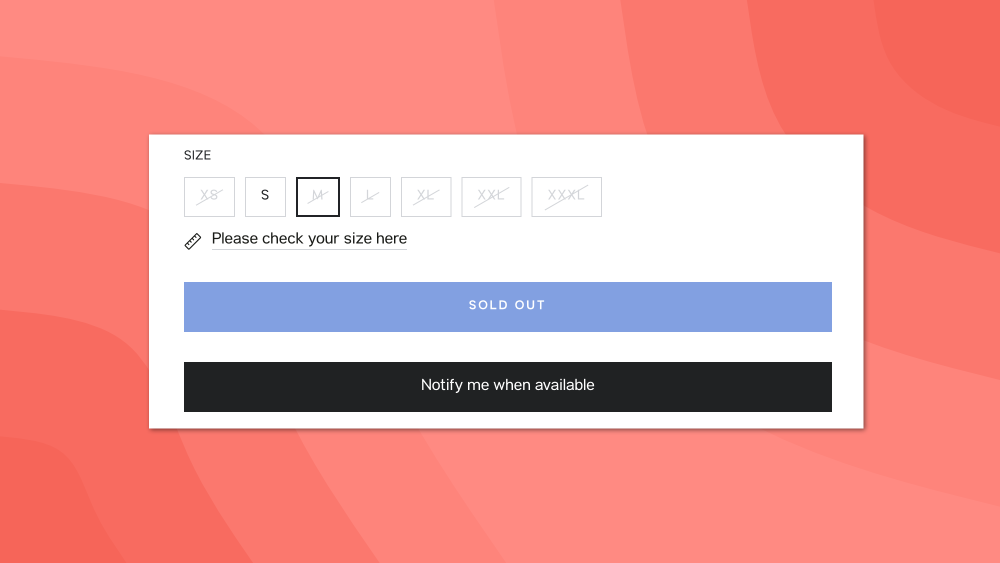
To double check this, I looked for a product on the same site that had reduced availability. I found one where certain sizes were out of stock. Visually these sizes appear crossed out and faded (the colour contrast here is not good). You can still select these out of stock sizes, but can’t add them to the cart. Instead you are presented with a 'Notify me when available' button, a familiar e-commerce design pattern.

So, this website is clearly well stocked if you are a sighted user, but not if you use a screen reader. I'm sure this wasn't the developers intention or the message the business wanted to give.
The developers for this website have clearly cared about accessibility in terms of the build. However, it appears that they haven’t fully tested their approach to ensure it works as intended. As a result the store is potentially losing customers without realising why.
I know from my own accessibility journey, that we can easily start incorporating accessibility considerations into our work without fully understanding the impact. We go off and learn about how we can programmatically make a page accessible, but this is dangerous if not paired with testing. Without both, we risk introducing new barriers.
Accessibility is important. Testing our work is accessible is more so.